IN-Conversation With Raj Khatri, A Kickass Movie Poster Artist!
Raj Khatri is a Senior Art Director with Marching Ants Advertising Pvt. Ltd., and his bio has too many titles to his name – learner / explorer / browser / collector / movie buff / rockaholic / tech-geek / foodie / traveler / visualizer / designer / digital artist / illustrator / inspired by the world of movies and music. He has no formal training in art, and is a self disciplined artist who believes that no degree in the world can override the real zeal to learn.
We were fortunate enough to have him interact with us. The complete interview-
Raj, let’s begin with your ‘origin’ story. Tell us about your roots and how you ended up making awesome posters for a living?
I belong to the lucky ones born in the 80’s, the ones who have seen everything from radio to audio cassettes to the movie halls, VHS, VCRS, cable connections, color TV, Doordarshan, Satellite TV, 8bit cartridge games, mixed tapes recordings, Walkman’s, audio CD’s , mobile phones, PC games, the social media, smartphones and tablets.
Being an extremely curious kid, all the artwork related to all the above mentioned ‘goodness’ always caught my attention. I was a kid whose favorite ‘treat’ was looking at the cheesy artworks galore at the video parlor rather than going to an ice cream parlor.
In school, every classroom has a scribbler, the one who sits in the last bench and keeps drawing things on his notebooks, depicting scenes and characters from a movie or portraits from the textbooks. I was that kid in my class 🙂
I was the ‘go-to-guy’ to get the science lab charts drawn or the one to represent the ‘class’ in a drawing completion or just to do fancy typography with names on greeting cards, so the art bug caught me quite early in life.
Few years down the lane from my school days I was in college studying science, which was not something that caught my attention so I was still the last-bencher but by now I had started scribbling cassette covers form my personal collection of albums of legendry bands like Iron Maiden, Metallica, Megadeth, Pantera, AC/DC etc.
For hours I would keep looking at those lovely album inlay arts and admire the designing, typography, colors etc but I had no clue on how all that was done though I would still try to replicate those artworks with magazine cutouts and sketch pens for my mixed tape cover arts.
And then, “Wallah”!
I was introduced to computer arts and Photoshop in 2001 and from that day my world changed completely. I realized this is what I was looking for all my life, all my quest for good poster art and album art , magazine covers , comic book arts , video game arts and VHS covers culminated to this.
I WANTED TO BE A POSTER ARTIST! 🙂
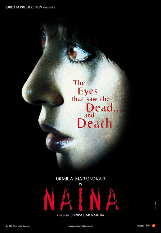
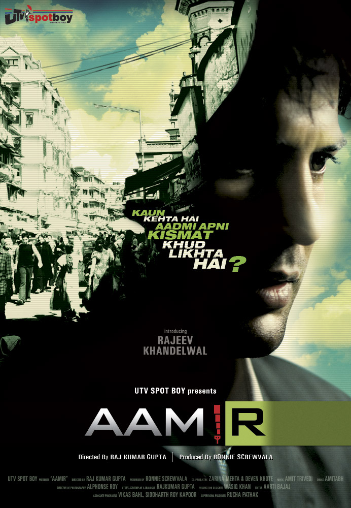
Professionally I started off in late 2002 as a small time freelancer doing logos and web interfaces and creating mock posters using movie grabs from video cds. Over the time I switched few jobs and places meanwhile also got my hands dirty in illustrator by doing a lot and lot of vector artwork. Then in Jan 2005 I landed up in the place where I always wanted to be. I joined in as a Jr. designer in a film publicity design house called ‘Epigram advertising’, where I learnt all the basics and essentials about the movie poster art in the country and worked on several projects like ‘Naina’ (my very first campaign ), ‘Zinda’, ‘Iqbal’, ‘Nishabd’, ‘Jodha Akhbar’,’Aamir’ etc.
During this period I also doubled up as a web designer at movietalkes.com. I also designed websites for ‘AR Rahman’, ‘Akshay Kumar’ and also for movies like ‘Rang De Basanti’, ‘Lage Raho Munnabhai’ and ‘Mangal Pandey’.
After 4 years of working at Epigram I moved on to a more challenging place ,’Marching Ants advertising’, and it’s been 6 years here and now I work as a Senior Art Director. In these last 10 years I have had the privilege to work on more than 100 movies and to design more than 180 official movie posters.
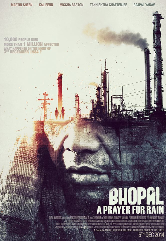
From Naina (2005) to Bhopal (2014) you have been in this line of work for 10 years now, so if today you were to give an advice(just one) to a new entrant who shares the same passion for art as you do, what would that be?
The advice that I would give is –“Love why you do and never run behind money, let your skills seduce it’ and thrive to achieve the best in comparison to the world and not just your rival, and ‘Always feed your curiosity’ and remember that a learner is always progressive.
From conceiving the idea to finishing the product, please guide us through the meticulous process of movie poster making?
Once we are done with the briefing, me and my team sit on the drawing board brainstorming with generic ideas and concepts that can be pitched., then we pull out visual style references for the entire look and feel, which is followed by designing the ‘title’ of the movie which also becomes its ‘logo’. Once we lock down on the ‘ideas’ we scribble thumbnails and share with each other and then each poster is allotted to a team member depending upon who conceived the original idea during the brainstorming session to take it forward.
The concepts are developed into a ‘mockup’ poster with stock imagery with complete detail and visual look and feel and then they are presented to the client and once it’s approved by them. We take it further and shoot with the actual cast members keeping these mockups as visual reference in the shoot. Post shoot, the poster is redone with much more details and flair using the shoot images and movie props using form the movie image bank.
Once approved by the client, the final artwork is done on a much higher resolution with all the minute details. In the end the poster is sent for color proofing, once the colors are achieved as per our approval, we send it for final printing.
You’ve designed posters for various genres of movies but is there any particular genre that thrills you more than others and why?
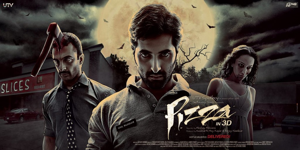
Well! Over the years I have had the chance to work on many stories and genres, but I think for every poster artist, darker the theme the better it is as it gives a wide scope to create ‘visuals’ that are striking and visceral . Hence I love working on horror /thriller genres.
Raj, apart from the posters you make for movies, you also do significant independent work, what fuels your Indies?
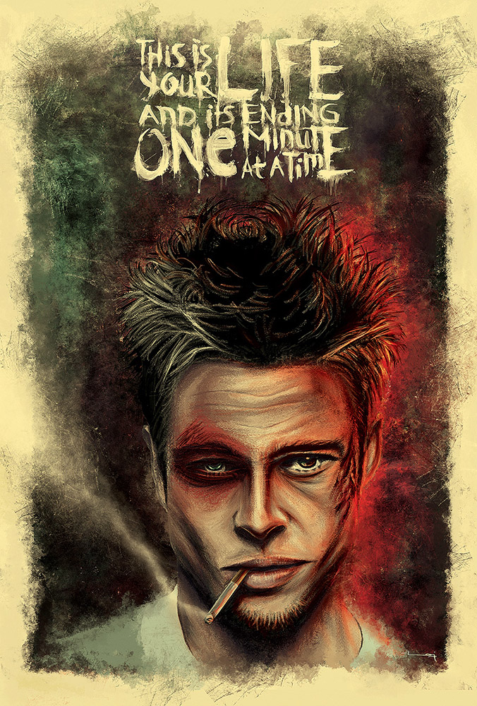
All my life I was always inclined towards the medium of painting and illustrations, the feel of strokes creating ‘images’ fascinated me since my early nascent days, so ever since the advent of digital painting I was completely hooked to it.
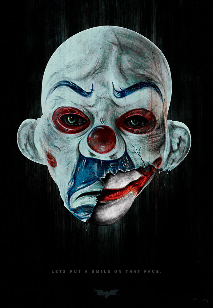
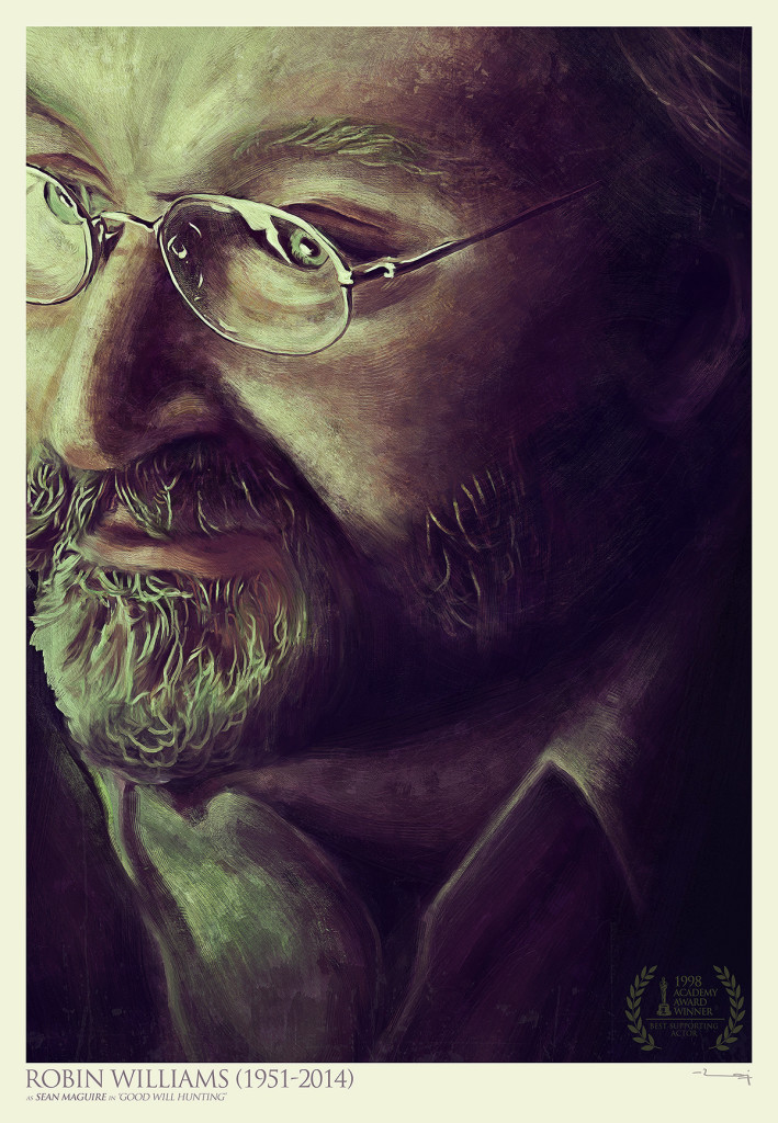
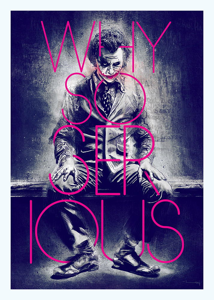
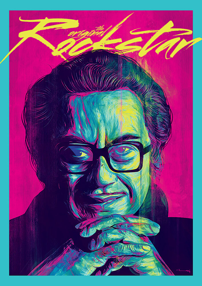
I feel everyone should have a pet project(s), something to feed your own hunger at your own leisure, without any client amendments, deadline or higher pressures, it really keeps the fuel burning in you. I started developing my personal painting and illustrations which were inspired by myriad of things like movies, actors, music, and all the pop culture references in between. It started as a basic unwinding exercise which now has matured into a full-fledged parallel portfolio of mine.
Among all the awesome posters you have designed, which one was the most taxing to make?
Well! There were many of them; some were taxing because of the people I had to deal with, some because of amount of work that went into it while some were because of the deadline crunch on it.
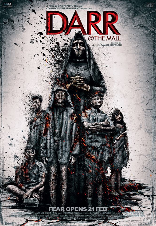
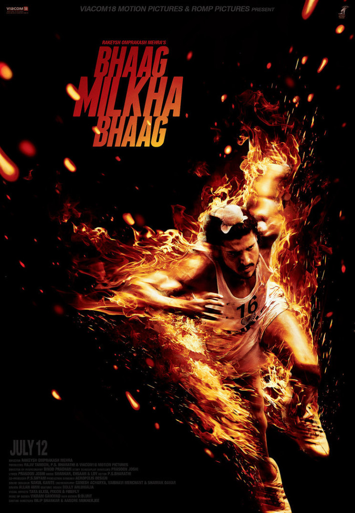
In recent times I loved the work that I was able to pull off for ‘Bhaag Milkha Bhaag’ fire poster and ‘Darr @ The Mall’ ashes poster. Both of them were intricate and detailed and really time consuming but utterly satisfying in the end.
Poster making is a time taking process, so how do you pacify the clients when you don’t meet deadlines?
“Good things come to all those who wait”, that’s the motto we believe and convey to the clients and most of the times the final output justifies the breach in the deadline.
What’s the first step in your designing process and what tools do you use to finish the product? How many people are involved in a single poster?
It always starts with a scribble, a very rough and loose one depicting the composition, angle and layout of the poster. Then ‘illustrator’ is used for making the logo and vector, if required. Sometimes apps like ‘3dmax’ and ‘Maya’ also is used for special cases to create a C.G (computer generated) object which is not possible to achieve via shoot.
Finally for composition and manipulation there is nothing better than ‘Photoshop’. It’s like the other half of a poster artist in today’s world. The better you know each other the better for the final artwork .It’s almost like the riders and their flying banshees from the movie avatar.
Mostly there are only two people involved in designing a poster, one who conceives and does the entire designing from pre-shoot mockup to the final post shoot presentation. Second one is the one who does the final art working. All of this is done under the supervision of the art director heading the project.
What’s the best movie poster that you didn’t make? And which poster artists’ work do you closely follow?
I liked what was done for the ‘Rockstar’ movie, great illustrations by a polish artist ‘Grzegorz Domaradzki’ aka ‘GABZ’. I also liked the treatment that was done for the movie ‘Jai Ho!’, it was quite fresh for a Salman Khan film.
Poster for the Bengali movie ‘Nirbaak’ by ‘Grinning Tree Studio’ in Kolkata was also really good.
If an independent movie director approaches you with challenging work but says he has no money to pay you, would you still design the poster, why?
I don’t do movie posters independently so that director has to approach me via ‘Marching Ants’.
What’s in store for 2015 and where do you see yourself in the next 10 years?
2015 has a lot of interesting projects in pipeline, some really conceptual and wacky posters to be looked forward to as well as some really big budget movies too. On a personal front I am planning to do a series of painted posters as a tribute to my favorite movies over the years, it’s going to be an mammothian task to complete the entire series, I will also accommodate some minimalist / illustrated posters and as always some kickass portraits too. So it looks like a very busy and exciting year ahead of me.
In next 10 years I hope to do posters for mainstream International movies and also have at least a dozen of good solo exhibitions under my belt.
Thank you for taking out valuable time from your busy schedule and talking with Indian Nerve. It was really great conversing with you Raj.
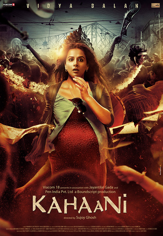
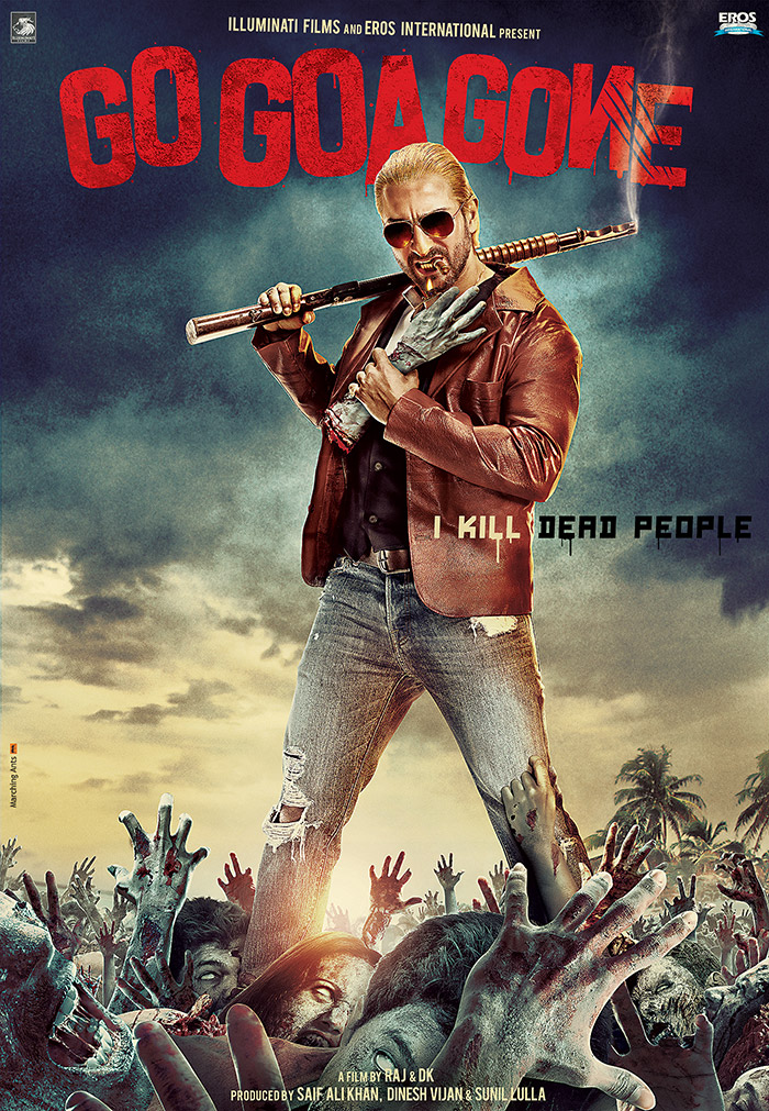
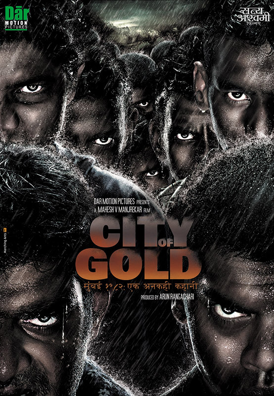
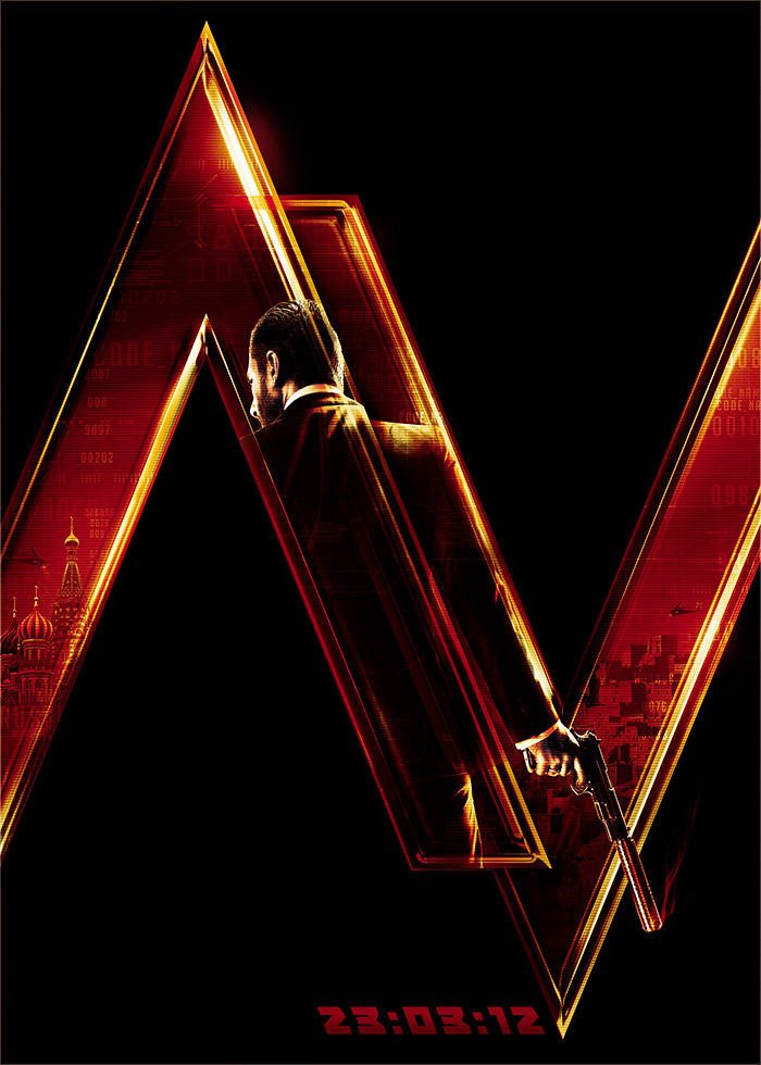
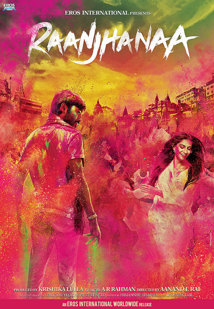
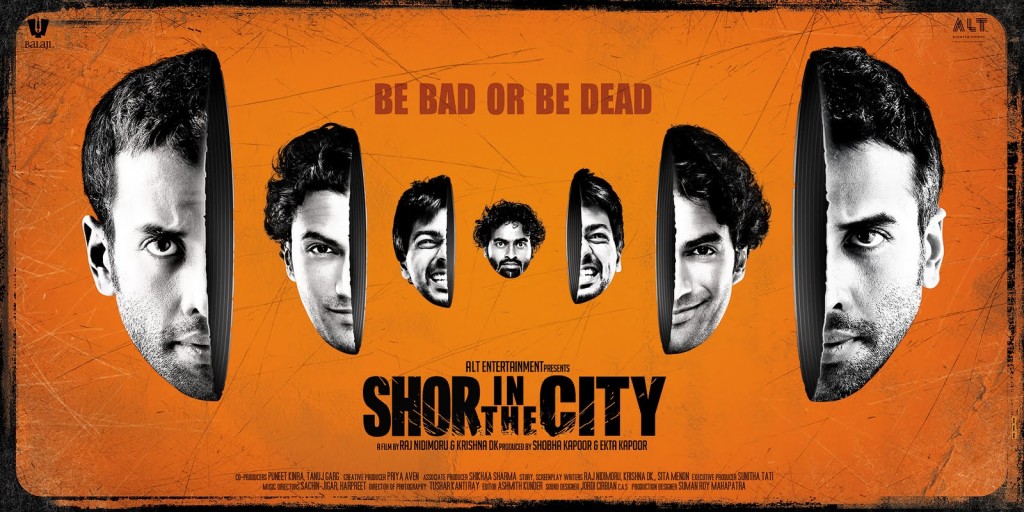
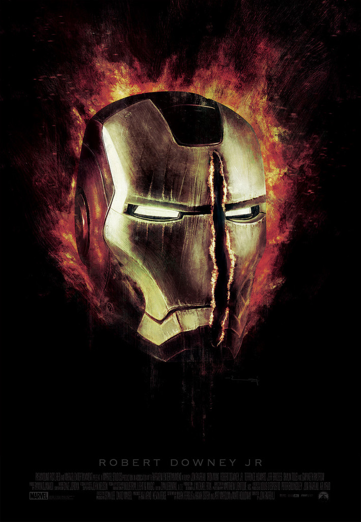
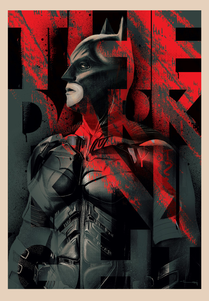
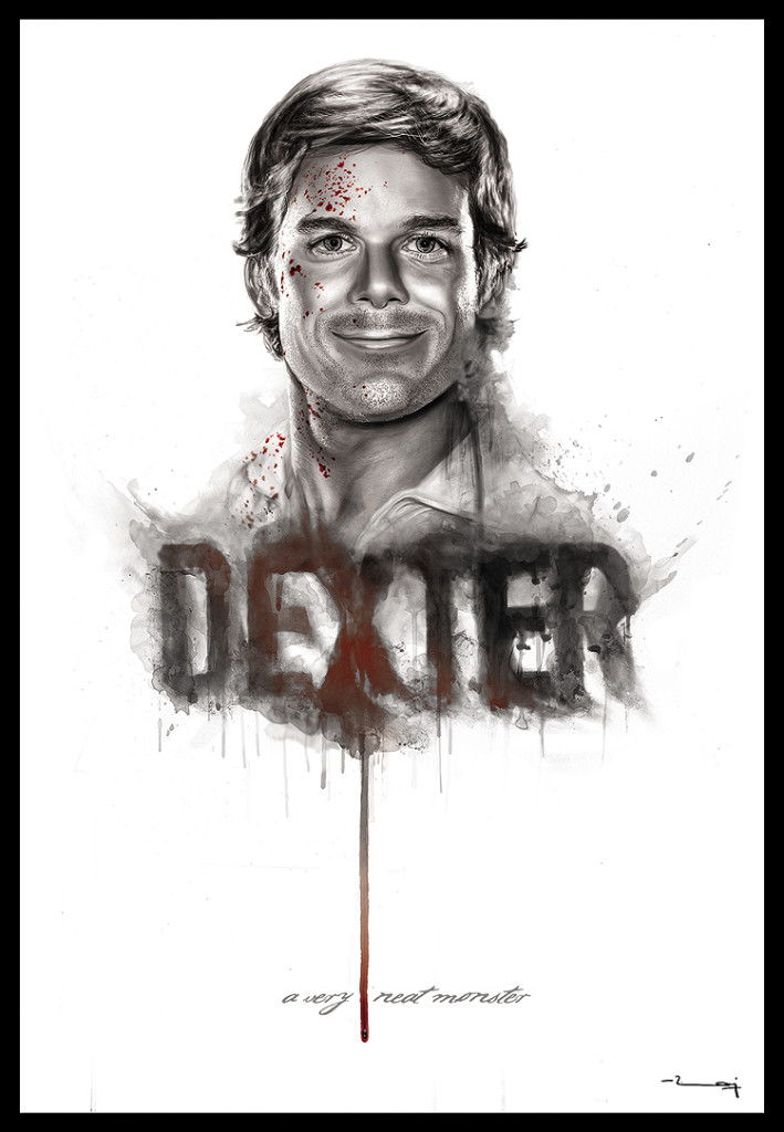
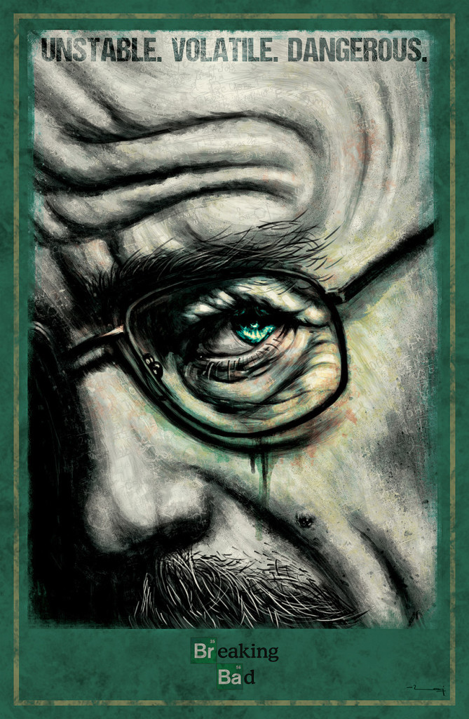
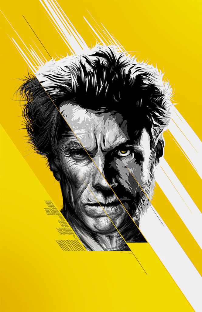
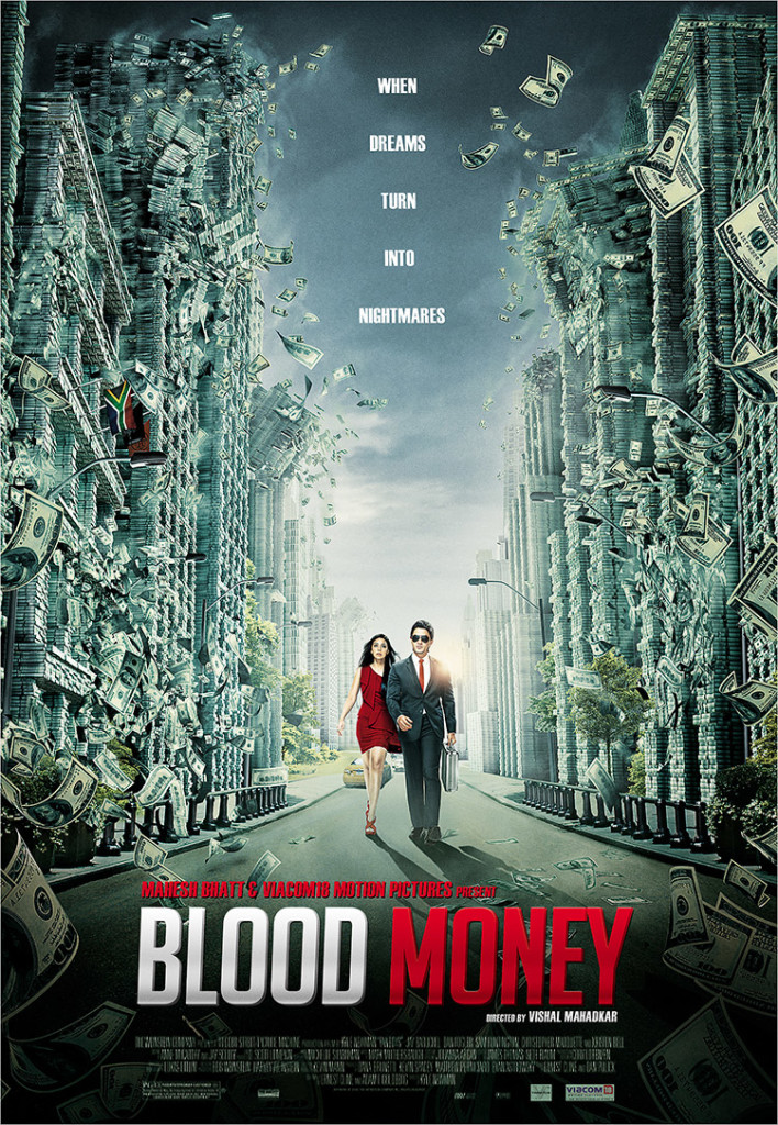
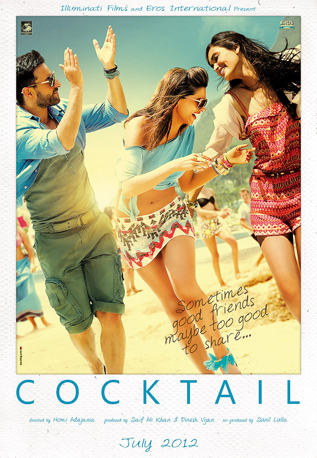
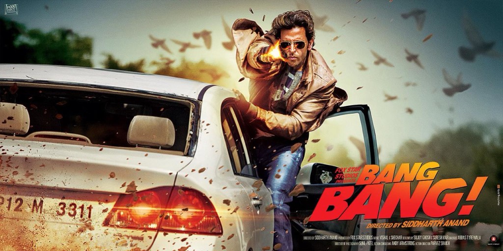
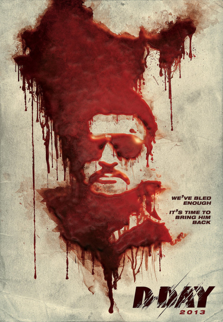
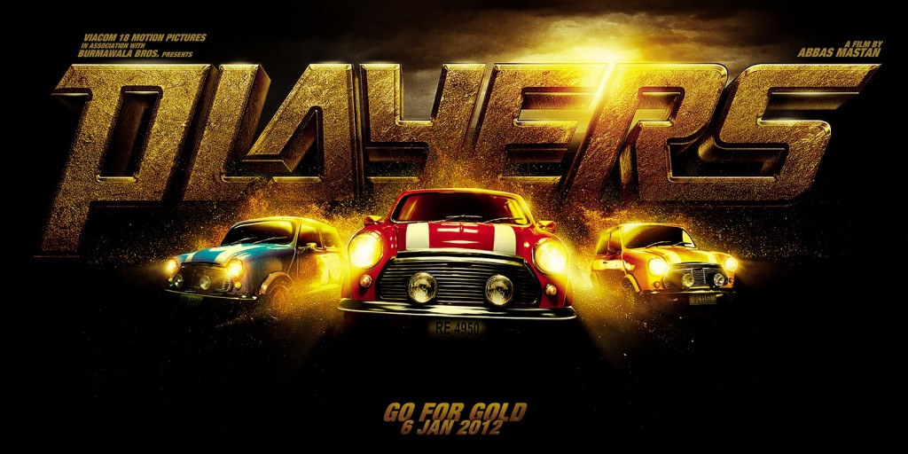
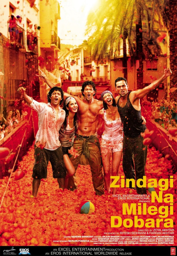
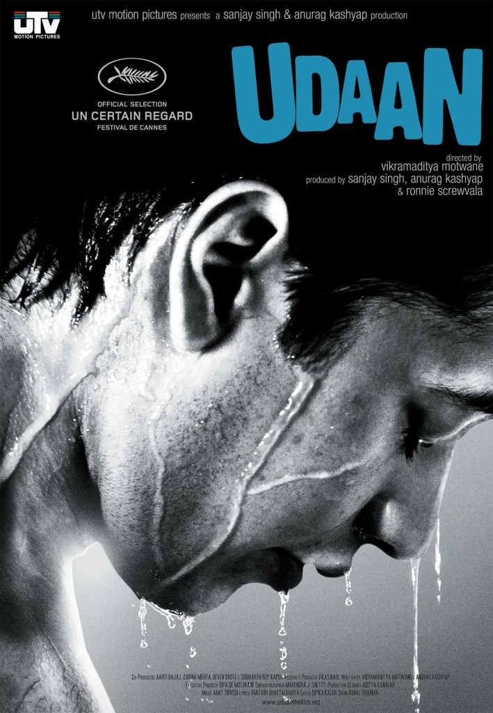
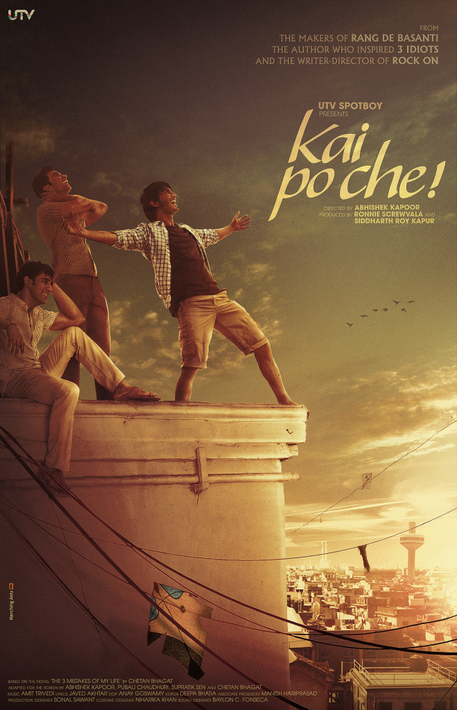
Raj shared some more awesome posters with us that he has designed. Do check them out and get awed!
and dont forget to follow Raj on Facebook ,Behance and Twitter.If you loved the posters he made and want them to increase the cool quotient of your house then you can purchase them at PosterGully .
|
← Previous Story BABY | Movie Review – High On Swag, Low On Wit.
|
Next Story → Watch : Marvel’s ‘Fantastic Four’ Teaser Trailer |
-
Advertisement
Search
Copyright © 2020 Indian Nerve. All Rights Reserved.

1 Comment